|
Tables In DreamWeaver |
||||||||||||||||||||||||||||||||||||
|
Working with Tables in
DreamWeaver The basic structure of Web pages are in tables. Although you can't always see the tables in a Web browser, you can see them while using Macromedia DreamWeaver. With this in mind, understanding how tables work and how to use them is critical in Web design. The
Table/Cell Relationship:
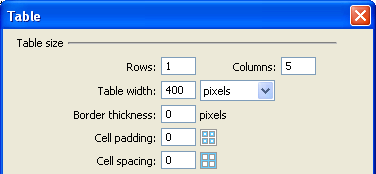
It's actually five separate images each contained within their own cell. Why would someone want to do this? First of all, these five images are now held strictly in place by the table. Secondly, each image can now be made into a link which would make this graphic useful as a navigation bar if it said something like Home, Contact, Links, etc. These cells are all contained within one table. Here are the settings for the above table:
The table dimensions are set to 1 row by 5 columns because there are 5 blocks of images. The total image width is 400 pixels, so the width of the table is set to 400 pixels. The border set to 0 makes the table holding these images transparent in a Web browser. Absolute vs.
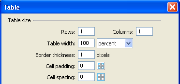
Relative Dimensions: For example, try inserting a table on a blank page with the following settings:
In particular, make sure that the table is 100 Percent wide and the border is set to 1 so that you can see the results. Directly underneath this table, try inserting another table that is 50 percent wide. Click here to see an example of this page. It's easy to see how this idea can be applied to make your pages adjust themselves to the different screen sizes and viewing preferences of different people. This idea can also be used on individual cells. Make a table with two cells, select inside the first cell and set the width to "20%" inside the Properties window like in the following image.
The other cell automatically takes up 80%, but you can specifically set it to 80% to be safe. Click here to see an example of this page. As you can see, using relative widths makes ideas about "Web safe" dimensions less important. As technology progresses, more and more people are using larger monitors and higher resolutions, but many people still have smaller desktop areas. Instead of designing your site with specific dimensions in mind, you might want to give relative widths a try. Cell Padding and
Cell Spacing:
The table above had to be adjusted to 430 pixels wide since the images are in there (400 pixels wide total) along with the six 5-pixel-wide spaces, the table's width has been forcibly increased (5X6=30, 30+400=430). This is also important to remember when using cell padding. Cell padding sets the distance of the cell's content from the borders. Notice the difference in these two examples (The borders have been set to a value of 1 so that you can get a better idea of where cells and tables are):
Clearly, the one on the right looks correct. Cell padding, however, is useful when you want text to be away from the borders. Notice the difference in these two examples:
In this example, the one on the left looks correct. The above two examples show another important concept of the table/cell relationship: tables within tables. Why make tables within tables when you could just make more cells? For the above two examples, cell spacing and cell padding are defined for a table, not for a cell. Look at the following example of the problem that would arise with cells:
The example above is a single table split into 3 cells. The cells on the left end and right end have been split into 2 rows. See how the blank space has been added to the cell on the right and it automatically increases the size of the cell on the left? This can become a huge problem with a big page layout. Instead, it is better to do this:
See how a blank space has been added to the bottom cell of the right table? The table stretches the cell it's in which stretches the cell on the left side, but the tables within them stay the right sizes. |