A common misconception for print design students to
make is to underestimate power of fonts to evoke a theme.
Many sites on the Internet provide free fonts for you to use.
save font to your C:/windows/ fonts folder for useIn fact it is extremely common for newbies to use the default font of most processors - New Times Roman
which was originally designed by the New York Times newspaper as a revision of the ancient
Roman Empire font.
( well actually Romans did not have printing presses as such so font is a slight misnomer Gutenberg invented the first moveable type printing press in 1436)
Pleeeeeaze restrain the use of NT- Roman for journalism and formal reports where it's
conservative appeal will make your words look more credible and intelligent.There are such a great variety of fonts on your computer and on the Net that you should
never run out of creative uses for them and as a result your works will appear more
powerful and unique.
Remember that less than a dozen fonts are supported by present Internet browsers such as Explorer or Netscape (anyone still use it) but this will change. So its pointless to use a font that will not appear
on your page.
edited with transform>skew in PhotoShop
Lets look at the technical aspects of fonts now (the stuff knowledge is made of good to study)
Font Families
Fonts have unique names but reside in FONT FAMILIES. The generic family names for fonts are:
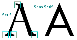
- Serif Fonts
- These are fonts that are proportional (some letters are bigger than others) and have serifs
(the little lines at the tops and bottoms of letters like "l" or "h"). Examples are: Times,
Garamond, Century Schoolbook.
Sans Serif Fonts- These fonts are also proportional, but they do not have serifs. Examples are: Helvetica,
Geneva , Arial.
Monospace Fonts- These fonts are NOT proportional, meaning every letter is the same size as every other letter.
This tends to be used to mirror a "typewriter" look, or those old computer monitors and
dot-matrix printers. The best example of this is Courier.
Cursive Fonts- These are fonts that try to look like handwriting. They tend to be very curvy.
Examples are : WaterTank, Augie, Comic Sans.
Fantasy Fonts- These are fonts that cannot be defined by one of the above four characteristics.
Such as Bizzaro Brad Taco Salad
All About Type
Movable type, developed by Johannes Gutenberg in the 15th century, has been called one of the great inventions of mankind: because of it, printed knowledge became accessible to more than just the learned few. It could be said without exaggeration that movable type is responsible for the so-called Information Age, our own age.
Not surprisingly, early type was based exclusively on handwritten characters; it mimicked the strokes of a master scribe's pen.

Type evolved quickly, but many typefaces still show vestiges of their handwritten origins. The most obvious vestige is the serif, which appears in more than half the typefaces in existence today.
The serif replicates the mark a pen might make as it lifted from paper at the end of a stroke. In addition, many of these serif typefaces have thick and thin strokes, such as would be produced by a pen.
Measurement
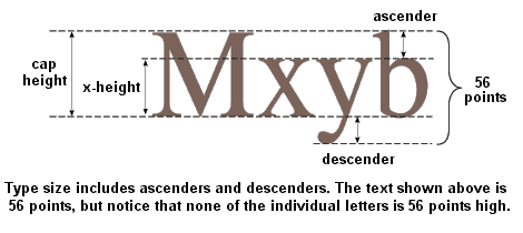
Type is traditionally measured in points and picas, a system similar to inches and feet: 12 points equal one pica.
The increments of pica measurement are very small :
6 picas or 72 points equal one inch
and are thus very appropriate for measuring type. The point size of a given font is measured from the top of the font's ascenders to the bottom of its descenders. A font's cap height is the measure of the height of an uppercase (capital) letter; its x-height is the measure of a lowercase (small) letter.
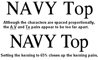
Kerning
Kerning is a process that moves optically distant letter pairs closer together than their cells would normally allow. A proportional font need not be kerned to be readable; script fonts, for example, may not be kerned. But kerning is a mark of typographic quality, and a well-made font will have kerning information built into it, so that all its optically-distant letter pairs are affected.