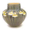
Principles of Design
Principles of design can only be alluded to, as each culture, at each historical stage of existence will have a diversity of viewpoints on the topic of - what constitutes good design.
Ultimately it is the effectiveness of the design based on its goal whether conscious or unconscious that governs the notion of good design.
Designers must have a language to discuss their art and evaluate its effectiveness.
Good design can have bad consequences.
There is no accounting for bad taste!
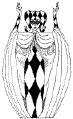
1. Balance
All elements are placed in a way that gives an impression of steadiness. There are two types of balance:
Formal Balance is achieved when a line drawn through the centre of the design would create two halves that are similar to one another or symmetrical. Formal balance gives a sense of dignity, strength, and security.
Informal Balance is a balance of objects that may look different but have equal weight to the eye. It allows for a more flexible placement of message elements in the layout. The elements are not symmetrically centered, but must be placed so that a state of equilibrium exists.
2. Rhythm
Rhythm is repetition.
In graphic design, rhythm occurs when a certain element is repeated.
It can add movement to a design. It looks like something is happening and leads the reader’s eye in a desired direction. Good rhythm helps the reader maintain interest in the design.
3. Proportion

Proportion is the size relationship of one part to another.
By itself, the size of an object has little meaning.
Only by comparing it to something else can we say it’s too big or too small.
In graphic design the proportions of one element to another should be correct. Although some elements may be larger or smaller, the effect should be pleasing.
To achieve good proportion in a layout, the designer must regulate the space assigned each element.
By achieving this, the mathematical relationship that exists between each element is not readily observed by the reader.
4. Contrast

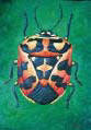
The purpose of contrast in design is to create interest in the product or work of art.
Interest is typically created by change in size, shape, colour, tone, typeface, and direction.
Illustrations, photos, and type can individually be varied in size and weight.
The use of different text styles (bold, italic, outline, shadow, and underline) and varying font point sizes adds contrast and serves to emphasize areas or words in the message.
Shape can be achieved by varying geometric shapes such as squares, rectangles, or triangles. Typically, similar shapes like squares and rectangles are grouped together.
Colour affects people in different ways.
Red, yellow, and orange are warm colours often signifying danger or excitement.
Blue, violet, and green are cool colours associated with water.
Brown and green are earthy colours.
COLOUR HUE/ SATURATION USING RGB IN NUMBER OR HEXADECIMAL CODE click on this interactive device
and realize the principles of additive colour and hue
5. Unity
Unity is the most important principle of design.
It is the quality that holds the layout together in harmony. A design that effectively and efficiently communicates the message to the audience has good unity. Unity is most affected by element shape, element position, and type style. Using several different type sizes and styles in a layout causes it to appear confusing and disorganized. To achieve unity, the relationship of one element to another in placement must be considered. Each element needs to be placed on the page in a pleasing relationship with the other elements.
6. Variety
Variety is difference.
Variety in graphic design may add interest and excitement.
Good variety should be simple yet creative. One should consider the audience. The design should be appropriate to the subject matter of the printed piece. Age group affects the amount of variety you might use.
The younger the audience the more variety you can use while older audiences like a more traditional look.
Whatever design principle you use in your production, good planning is necessary to avoid last-minute problems.
It is the designer’s responsibility to see that the publication is produced in an acceptable manner.
The basic guidelines for Good Design are:
1. Consider the target group of viewers!!!!! What do they want? What do you want to say?
2. Be Consistent.
3. Keep it Simple.
4. Avoid Static Balance.
5. Establish a Dominant Element.
6. Images and Symbols Enhance the Message.
7. Utilize White Space.
Good design is often the result of trial and error!